R Plots
Various plots I've made using R with publicly available datasets.

Various plots I've made using R with publicly available datasets.


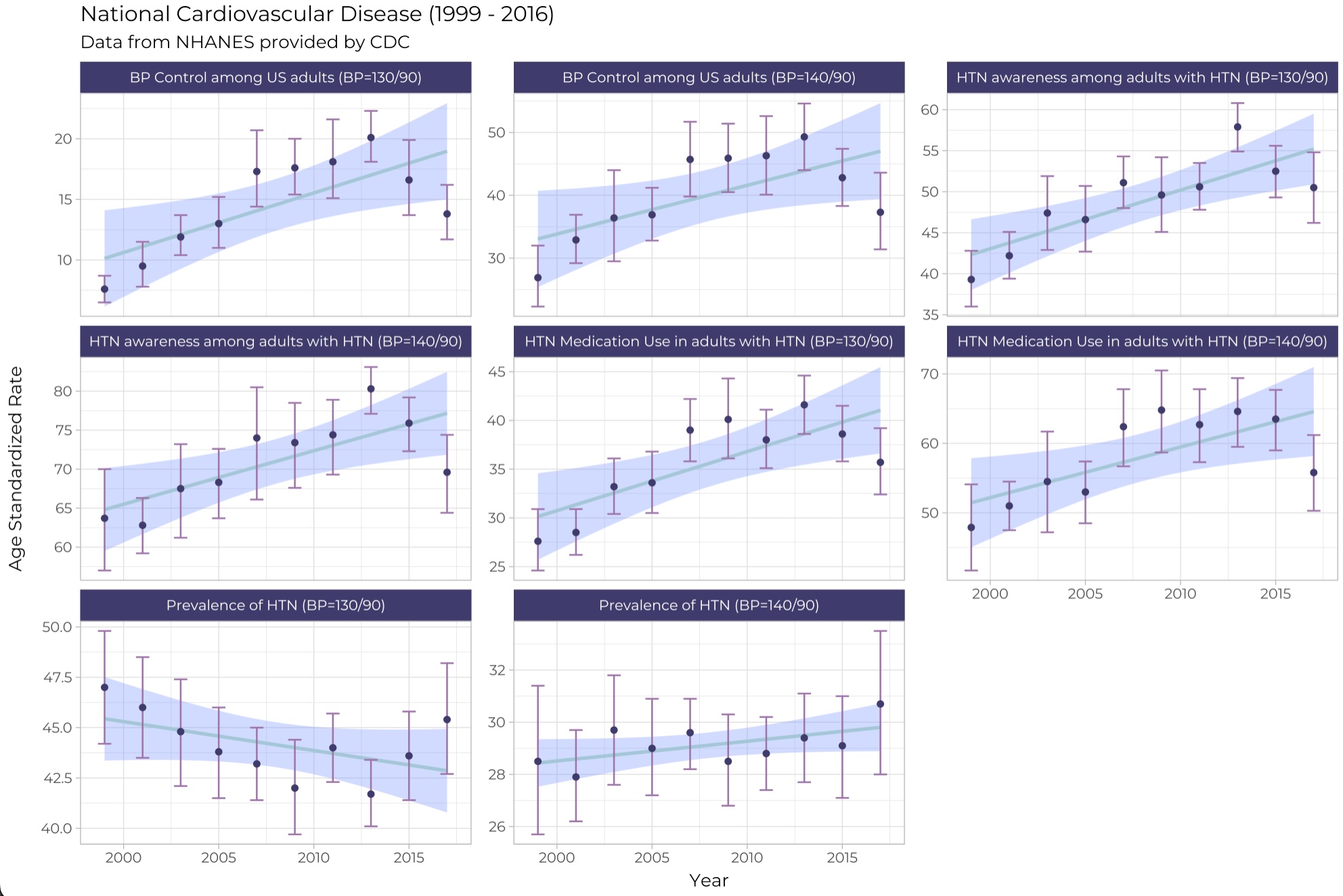
 # R Code for NHANES plot
 llibrary(tidyverse)

 cdcdata <- read_csv("data/National_Health_and_Nutrition_Examination_Survey__NHANES__-_National_Cardiovascular_Disease_Surveillance_System.csv")

 count(cdcdata, Class, Topic)

 overall_heart_disease <- filter(
   cdcdata,
   Topic == "Hypertension",
   Break_Out_Category == "Overall",
   Data_Value_Type == "Age-Standardized",
   QuestionId != "NH034",
   QuestionId != "NH024",
   !is.na(Data_Value)
 )

 hd_clean <- separate(overall_heart_disease, YearStart, c("start", "end"), sep = "-") %>%
   mutate(
     start = as.numeric(start),
     end = as.numeric(end)
   ) %>%
   mutate(
     label = case_when(
       QuestionId == "NH033" ~ "BP Control among US adults (BP=130/90)",
       QuestionId == "NH023" ~ "BP Control among US adults (BP=140/90)",
       QuestionId == "NH030" ~ "Prevalence of HTN (BP=130/90)",
       QuestionId == "NH020" ~ "Prevalence of HTN (BP=140/90)",
       QuestionId == "NH031" ~ "HTN awareness among adults with HTN (BP=130/90)",
       QuestionId == "NH021" ~ "HTN awareness among adults with HTN (BP=140/90)",
       QuestionId == "NH032" ~ "HTN Medication Use in adults with HTN (BP=130/90)",
       QuestionId == "NH022" ~ "HTN Medication Use in adults with HTN (BP=140/90)"

     )
   )

 library(showtext)
 font_add_google(name = "Montserrat", family = "Montserrat")
 showtext_auto()

 ggplot(hd_clean, aes(start, Data_Value)) +
   geom_smooth(method = "lm", color = "#A3C7D6", fill = "#83A2FF") +
   geom_errorbar(
     aes(ymin = Low_Confidence_Limit, ymax = High_Confidence_Limit),
     width = 0.7,
     color = "#9F73AB"
   ) +
   geom_point(color = "#3F3B6C") +
   facet_wrap("label", scales = "free_y", ncol = 3) +
   theme_light() +
   labs(
     title = "National Cardiovascular Disease (1999 - 2016)",
     subtitle = "Data from NHANES provided by CDC",
     # title = "NHANES Data on Cardiovascular Disease",
     x = "Year", y = "Age Standardized Rate",
   ) +
   theme(
     plot.title = element_text(hjust = 0.0),
     text = element_text(family = "Montserrat"),
     strip.background = element_rect(fill = "#3F3B6C")
   )

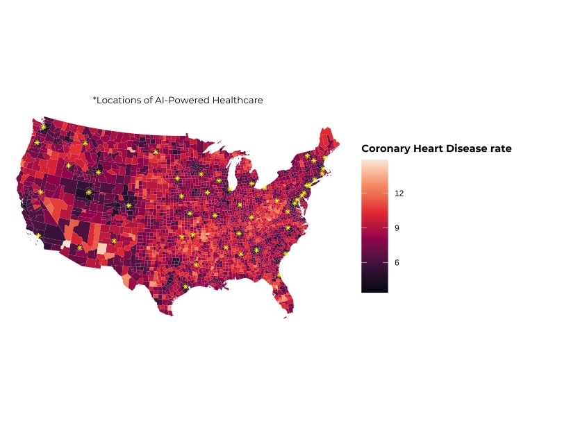
 # R Code for Chloropleth Map
library(sf)
library(readr)
library(tidyr)
library(dplyr)
library(ggplot2)

library(showtext)
font_add_google(name = "Montserrat", family = "Montserrat")
showtext_auto()

# get US Counties data
counties <- tigris::counties(cb = TRUE) |>
  # make the map less detailed so it is easier to plot
  st_simplify(dTolerance = 1000) |>
  # create the fips code
  mutate(FIPS = paste0(STATEFP, COUNTYFP))


# read in the hospital locations
hospitals_raw <- read_csv("rawdata/best_hospitals_states.csv", skip = 1) |>
  # remove hawaii and alaska
  filter(!State %in% c("AK", "HI")) |>
  # turn it into a spatial dataframe
  st_as_sf(coords = c("Longitude", "Latitude"), crs = 4326) |>
  # reproject to conic albers for plotting
  st_transform(5070)

# read USDA data
groceries_stores <- read_csv("rawdata/StateAndCountyData.csv") |>
  # filter to the grocery variable
  filter(Variable_Code == "GROCPTH16") |>
  # select only the fips and our variable of interest, renaming it
  select(FIPS, grocery_store_count = Value) |>
  # create a FIPS code by adding 0s to the left
  mutate(FIPS = sprintf("%05s", FIPS))

# read in the social vulnerability index data we cleaned
# join to our dataset
all_variables <- read_csv("cleandata/joined-svi-places.csv") |>
  left_join(groceries_stores)

# join all of the variables to the US counties
# remove hawaii, alaska, and territories
all_vars_sf <- left_join(counties, all_variables) |>
  filter(!STUSPS %in% c("HI", "AK", "AS", "MP", "VI", "PR", "GU")) |>
  st_transform(5070)


# create a plot of health disease and locate hospitals on the map
ggplot() +
  geom_sf(aes(fill = CHD), data = all_vars_sf, lwd = 0, alpha = 1) +
  geom_sf(data = hospitals_raw, color = "yellow", pch = 8) +
  scale_fill_viridis_c(option = "F") +
  theme_void() +
  theme(legend.position = "bottom") +
  labs(fill = "Coronary Heart Disease rate",
       subtitle = "*Locations of AI-Powered Healthcare") +
  theme(
    legend.title = element_text(family = "Montserrat", face = "bold", size = 11),
    legend.position = "right",
    plot.subtitle =element_text(hjust = 0.5, size = 10, family = "Montserrat"),
    axis.title = element_text(family = "Montserrat", face = "bold", size = 11),
    legend.key.size = unit(2, "lines")
  )


# remove all chracter columns for regression
model_data <- all_vars_sf |>
  st_drop_geometry() |>
  select(-where(is.character), -ALAND, -AWATER)

# predict obesity by everything else
mod <- lm(OBESITY ~ ., model_data)

mod_coefs <- broom::tidy(mod)

model_data
skimr::skim(model_data)

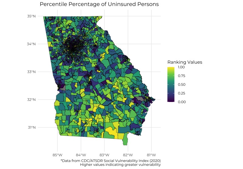
 # R Code for Georgia Plot showing percentile percentage of Uninsured Persons
 library(sf)

# print out the layes that are available
st_layers("data/SVI2020_GEORGIA_tract.gdb/")

# read in as sf object
tracts <- read_sf("data/SVI2020_GEORGIA_tract.gdb", layer = "SVI2020_GEORGIA_tract")

library(showtext)
font_add_google(name = "Montserrat", family = "Montserrat")
showtext_auto()

library(tidyverse)

map <- ggplot(tracts, aes(fill = EPL_UNINSUR)) +
  geom_sf(lwd = 0.15, color = "black")

# we use filter to remove outliers
tracts %>%
  filter(EPL_UNINSUR > -200) %>%
  ggplot(aes(fill = EPL_UNINSUR)) +
  geom_sf(lwd = 0.15, color = "black")

# instead of removing the values, we make the values missing
tracts %>%
  mutate(EPL_UNINSUR = ifelse(EPL_UNINSUR > -200, EPL_UNINSUR, NA)) %>%
  select(EPL_UNINSUR) %>%
  ggplot(aes(fill = EPL_UNINSUR)) +
  geom_sf(lwd = 0.15, color = "black") +
  # using pre-defined color scheme
  scale_fill_viridis_c(option = "viridis") +
  #specify desired color gradient
  #scale_fill_gradient(low = "red", high = "yellow") +
  theme_minimal() +
  labs(
    title = "Percentile Percentage of Uninsured Persons",
    #subtitle = "Ranking values range from 0 to 1, with higher values indicating greater
    #vulnerability",
    caption = "*Data from CDC/ATSDR Social Vulnerability Index (2020)
    Higher values indicating greater vulnerability",
    fill= "Ranking Values"
  ) +
  theme(
    plot.title = element_text(hjust = 0.5),
    text = element_text(family = "Montserrat")
  )


# make the map interactive
#plotly::ggplotly(map)

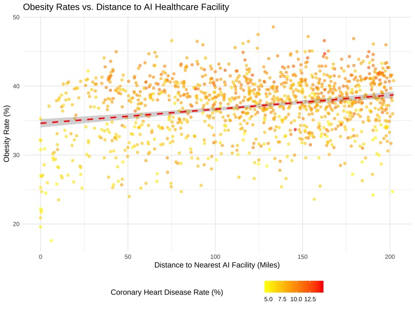
 # R Code for Spatial Regression plot
 #This is my regression

library(sf) # for spatial analysis
library(tidyverse)
install.packages("tigris")

# read the cleaned csv
places_df_raw <- read_csv("cleandata/joined-svi-places.csv")

# get the counties geometries from tigirs R package
counties <- tigris::counties(cb = TRUE)

# combine the state fips code with the county fips code
# to create the full FIPS code.
# need to convert to longitude and latitude (crs 4326)
# to compare with hospital locations
counties_clean <- counties |>
  transmute(FIPS = paste0(STATEFP, COUNTYFP)) |>
  st_transform(crs = 4326)

# create the data frame with locations of health care systems
ai_hc_systems <- data.frame(
  health_system = c(
    "Kaiser Permanente", "Stanford Health", "UC San Diego", "Mayo Clinic",
    "Mass General Brigham", "NYU Langone Health", "Duke Health",
    "Vanderbilt Health", "University of Wisconsin Madison Health"
  ),
  latitude = c(
    37.82833, 37.433868, 32.87624, 44.022446, 42.3471718, 40.7420735, 36.0070213,
    36.1409237, 43.0763751
  ),
  longitude = c(
    -122.23247, -122.18, -117.210327, -92.4680463, -71.0825069, -73.9743366,
    -78.9373479, -86.8016342, -89.4320049
  )
) |>
  st_as_sf(crs = 4326, coords = c("longitude", "latitude"))

# we want to filter to locations that are 200 miles away
one_mile_meters <- 1609.34 # one mile
two_hundred_miles <- one_mile_meters * 200 # two hundred miles away

# create a 200 mile radius around each hospital
hc_two_hundred_miles_buffer <- st_buffer(ai_hc_systems, two_hundred_miles)

# spatial filter all counties to the areas that are within 200 miles
counties_nearish_ai_hc <- st_filter(
  counties_clean,
  hc_two_hundred_miles_buffer
)

# calculate distance from AI health care system
dist_matrix <- st_distance(counties_nearish_ai_hc, ai_hc_systems)

# find the minimum distance for each county to a AI hc system
distance_from_ai_facility <- Rfast::rowMins(dist_matrix, value = TRUE)


places_with_distance <- inner_join(
  places_df_raw,
  # create a new column called nearest_ai_facility which calculates the distances to nearest hospital in miles
  mutate(counties_nearish_ai_hc, nearest_ai_facility = distance_from_ai_facility / one_mile_meters)
)

# fit a regression that estimates
mod <- lm(OBESITY ~ nearest_ai_facility + CHD + CASTHMA, data = places_with_distance)
summary(mod)


ggplot(places_with_distance, aes(x = nearest_ai_facility, y = OBESITY, color = CHD)) +
  geom_point(alpha = 0.6) +
  geom_smooth(method = "lm", color = "red", linetype = "dashed") +
  labs(
    title = "Obesity Rates vs. Distance to AI Healthcare Facility",
    x = "Distance to Nearest AI Facility (Miles)",
    y = "Obesity Rate (%)",
    color = "Coronary Heart Disease Rate (%)"
  ) +
  theme_minimal() +
  scale_color_gradient(low = "yellow", high = "red") +
  theme(legend.position = "bottom")